Monzo Brand Style Guide 2022 / Guideline
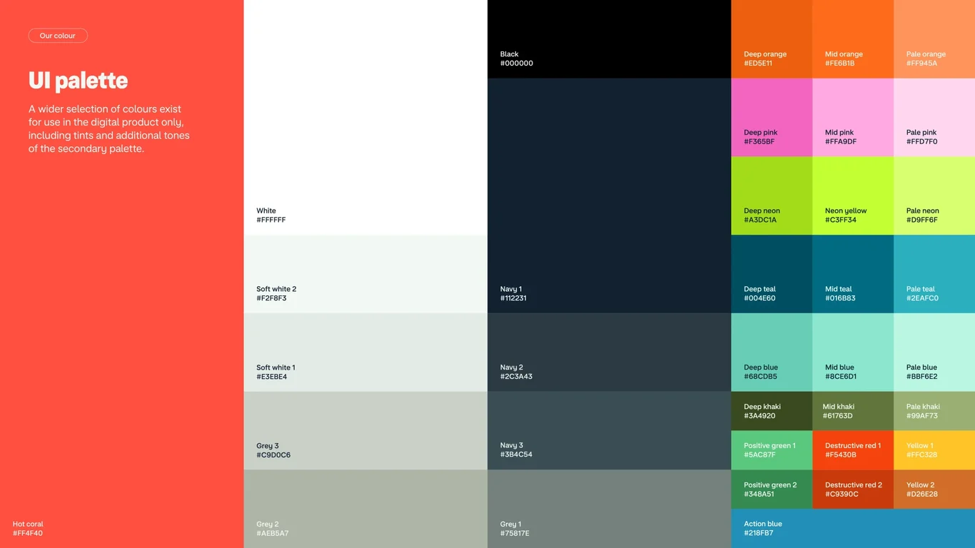
UI palette for digital product only
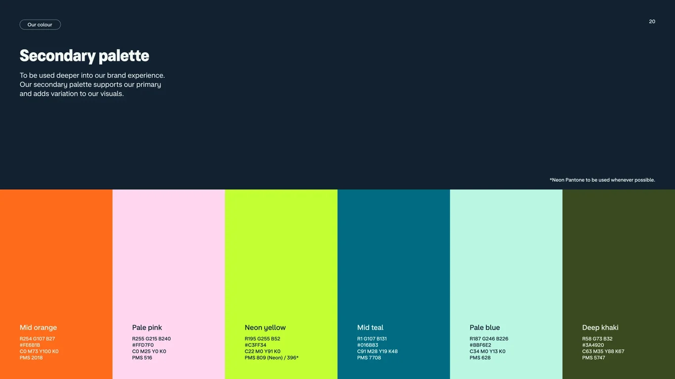
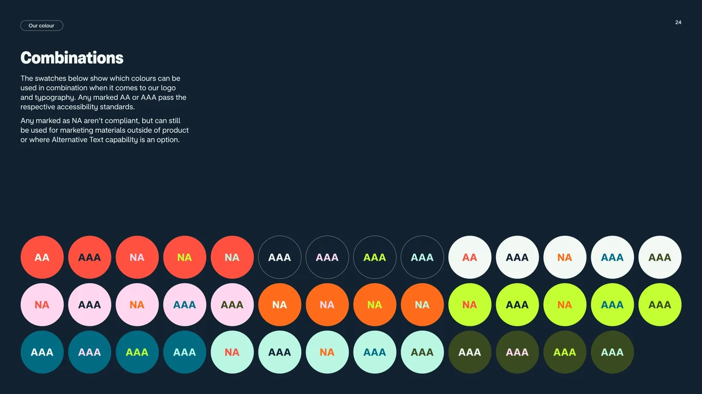
Extended color palette for digital use includes tints of secondary colors, black, and neutrals like white and greys for UI elements and accessibility
Slide 24 of 82
Monzo Brand Style Guide 2022 / Guideline
Extended color palette for digital use includes tints of secondary colors, black, and neutrals like white and greys for UI elements and accessibility
Slide 24 of 82