Widelabs Brand Guidelines 2017 / Guideline
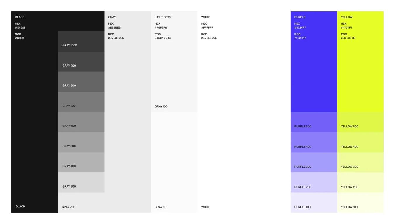
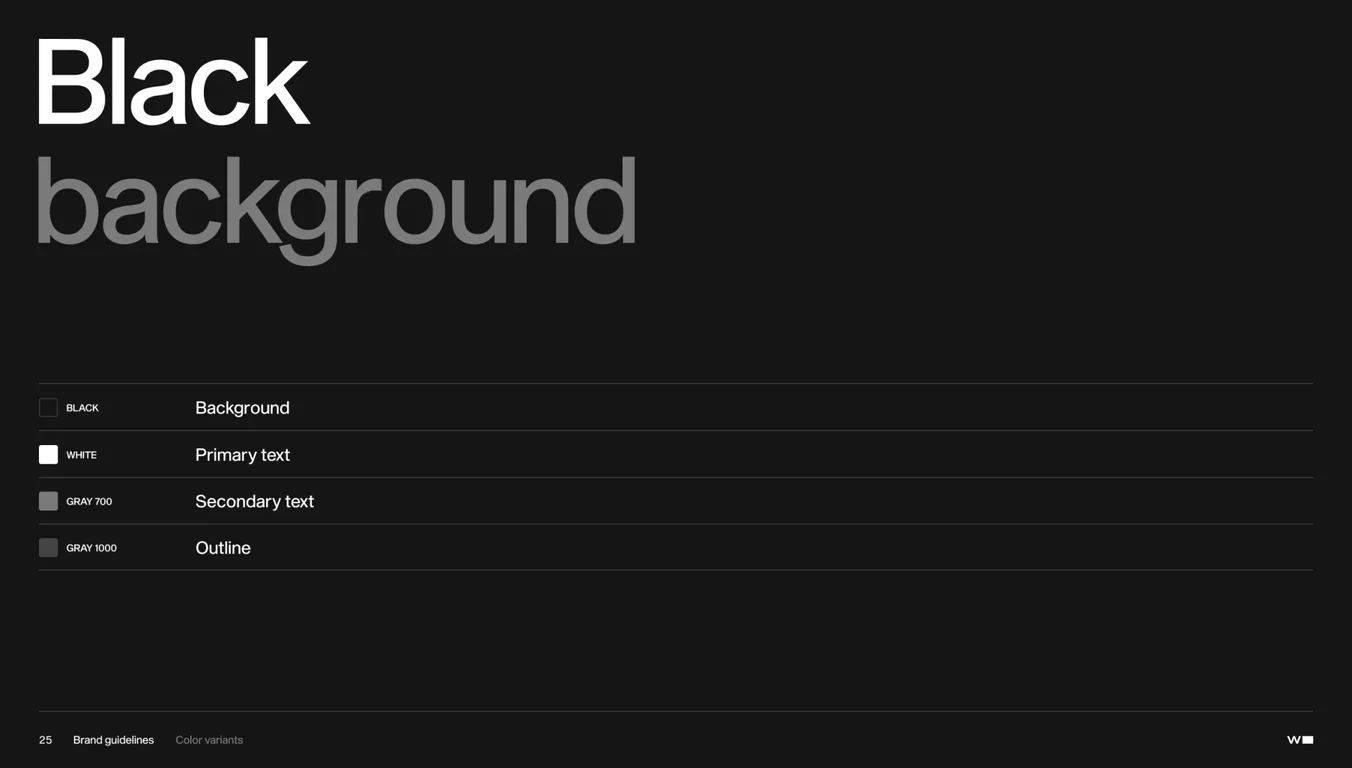
Primary color palette with hex codes, RGB values, and technical
Primary color palette with hex codes, RGB values, and technical specifications for accurate color implementation
Slide 22 of 50
Widelabs Brand Guidelines 2017 / Guideline
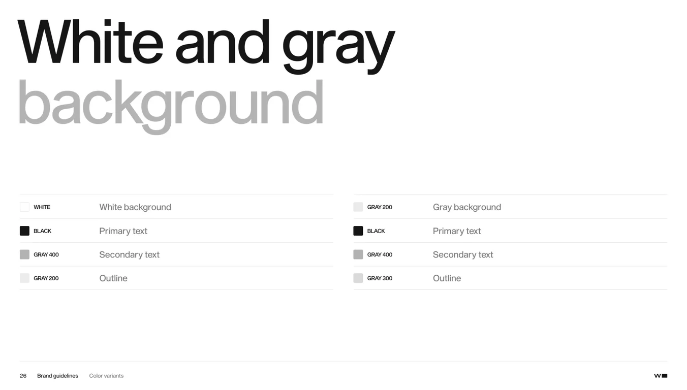
Primary color palette with hex codes, RGB values, and technical specifications for accurate color implementation
Slide 22 of 50