Skip to content
  • Home
  • Info
Decks Slides Marketplace

OurFamilyWizard Brand Guidelines / Guideline

Photography guidelines section index

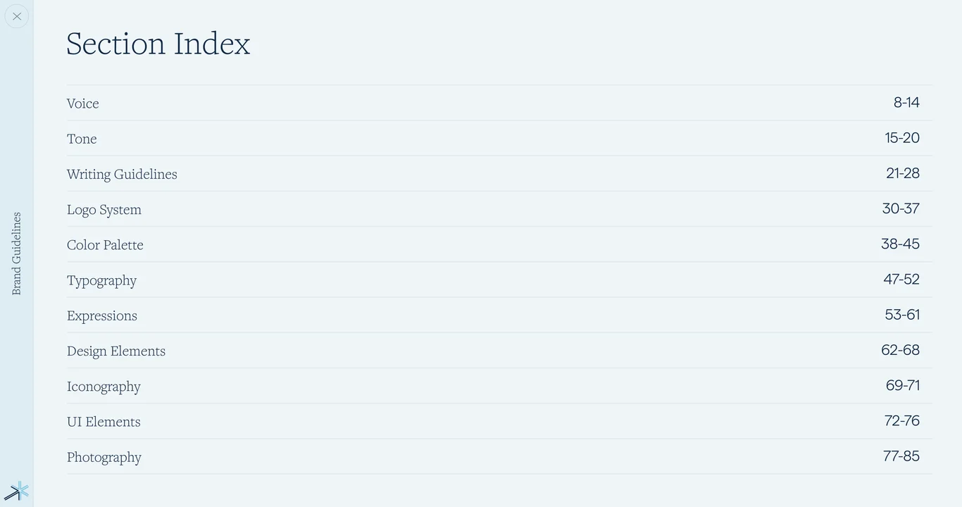
Table of contents for photography principles, stock photo categories, mood guidelines, and masking treatment rules

Slide 53 of 86

  1. OurFamilyWizard — Complete Brand Guidelines Book 01
  2. OurFamilyWizard co-parenting platform mission 02
  3. Bring harmony to families through life's challenges 03
  4. Brand vision: harmony through life's greatest challenges 04
  5. Brand foundation and guiding principles 05
  6. Core brand attributes and framework 06
  7. Voice and tone guidelines section index 07
  8. Voice attributes: overview and pyramid 08
  9. Empathetic voice: identifying with co-parents 09
  10. Realistically optimistic voice approach 10
  11. Credible voice: authority and expertise 11
  12. Empathetic voice: kindness and warmth 12
  13. Pragmatic voice: sensible and realistic 13
  14. Friendly not formal: conversational tone 14
  15. Tone chart, writing guidelines, and style tips 15
  16. Tone examples and copy variations 16
  17. Writing patterns and sentence structure 17
  18. Writing to parents: audience-specific guidelines 18
  19. Writing to professionals: tone and approach 19
  20. Style tips for voice and tone application 20
  21. Logo system guidelines section index 21
  22. Logo overview and primary variations 22
  23. Logo color application rules 23
  24. Spark symbol as core brand element 24
  25. App and web badge logo format 25
  26. Logo clearspace and minimum size rules 26
  27. Co-branding and partnership guidelines 27
  28. Incorrect logo usage and don't examples 28
  29. Brand system foundations and transitions 29
  30. Color palette section overview 30
  31. Primary color palette specifications 31
  32. Color pairings and effective combinations 32
  33. Suggested color schemes for applications 33
  34. Color proportions for balanced design 34
  35. Supporting colors and secondary palette 35
  36. Color accessibility and contrast standards 36
  37. Color applications in marketing materials 37
  38. Typeface system and font standards 38
  39. Typeface family and font specifications 39
  40. Type hierarchy and font sizing scale 40
  41. Fallback fonts for web and digital 41
  42. Italics, highlights, and emphasis styles 42
  43. Font weights and style variations 43
  44. Font examples and real-world applications 44
  45. Text formatting, spacing, and alignment 45
  46. Design system visual mockup 46
  47. Design elements and patterns section 47
  48. Layered capsule shape element 48
  49. Layered circles design pattern 49
  50. Rounded boxes and container shapes 50
  51. Earmarks as distinctive design detail 51
  52. List styling and bullet patterns 52
  53. Photography guidelines section index 53
  54. Stock photo categories and sourcing 54
  55. Core photography content principles 55
  56. Co-parents photography style guide 56
  57. Children in photography: style guidelines 57
  58. Professionals in photography: tone 58
  59. Photography mood and emotional tone 59
  60. Capsule mask treatment for photography 60
  61. Circle mask treatment for images 61
  62. Photography in use: real application examples 62
  63. Photography combinations and layouts 63
  64. Photography color and contrast usage 64
  65. Photography accessibility and alt text 65
  66. Photography overlay and text integration 66
  67. Photography consistency and rules 67
  68. Photography do and don't examples 68
  69. Icon system and standards overview 69
  70. Complete icon library and specifications 70
  71. Icon usage and contextual rules 71
  72. Icon sizing and scaling guidelines 72
  73. Icon colors and customization 73
  74. Icon clarity and legibility standards 74
  75. Icon combinations and grouping 75
  76. Icon do and don't examples 76
  77. UI elements and product visuals section 77
  78. Product visuals and mockup examples 78
  79. Literal UI elements and components 79
  80. Abstract UI patterns and system 80
  81. Concept UI illustrations and diagrams 81
  82. Buttons, inputs, and form components 82
  83. UI spacing, alignment, and grid 83
  84. UI interactions and component states 84
  85. Brand guidelines complete application 85
  86. OurFamilyWizard — contact for design inquiries 86

1/86

Deck.gallery

Curated by Muharrem Senyil

© 2026